In this post I’ll display global interest in Bitcoin and Ethereum over time, according to accesses to their Wikipedia articles, mentions in the New York Times, and as Google Searches.
The end of the year 2017 saw the “Bitcoin Bubble”, a period of one month where 1 Bitcoin was traded for up to $20000 on most exchanges. I am not invested in Bitcoin, and never was substantially, but cryptocurrencies and the blockchain technology still interest me.
Preprocessing
Preprocessing entails:
- Define necessary R packages
- Fetching the data
At this time, no user registration process is required to get to the data. Except for the New York Times Data, no API keys and authentication steps are necessary to call the Web-APIs mentioned below.
Load R packages
library(pageviews) # access Wikipedia
library(Quandl)    # provider of financial data
library(lubridate)
library(tidyverse)
library(gtrendsR)  # access Google trends API
# ggplot defaults
theme_set(theme_bw())
scale_colour_discrete <- function(...) scale_color_brewer(palette="Set1")
Define a wrapper function to access a Wikipedia API
The function contains quite a few of hardwired parameters. The pageviews package fetches the data. The function could be made a lot more flexible by adding more arguments, but that is not necessary for this blogpost.
The search function only works for terms for which an article exists with the same title in both the German and the English Wikipedia.
Luckily “Bitcoin” is such a term.
# Get the pageviews for "Search term"
# pageview data is available since 2015
startdate <- ymd("20150101")
enddate <- now()

wikipedia_de_vs_en <- function(term = "Bitcoin") {
  # call English wikipedia
  pageviews <- article_pageviews(
    project = "en.wikipedia",
    article = term,
    user_type = "user",
    start = startdate,
    end = enddate
  )
  # call German wikipedia
  pageviews2 <- article_pageviews(
    project = "de.wikipedia",
    article = term,
    user_type = "user",
    start = startdate,
    end = enddate
  )

  # combine to data frame
  pageviews.df <- bind_rows(pageviews, pageviews2) %>%
    mutate(language = case_when(
      language == "en" ~ "English Wikipedia",
      language == "de" ~ "German Wikipedia"
    ))

  #plot it with 2 panels
  ggplot(pageviews.df, aes(date, views, color = language)) +
    geom_line() +
    xlab("") + ylab("Views per Day") +
    theme(legend.position = "none") +
    facet_wrap(~ language, nrow = 2, scales = "free_y") +
    ggtitle(
      sprintf("Daily Pageviews of '%s' in the English and German Wikipedias", term),
      subtitle = "Human Users only"
    )
}
Data Visualization
(If you want to follow along, or verify the data: An interactive frontend that does the same is available at this url: https://tools.wmflabs.org )
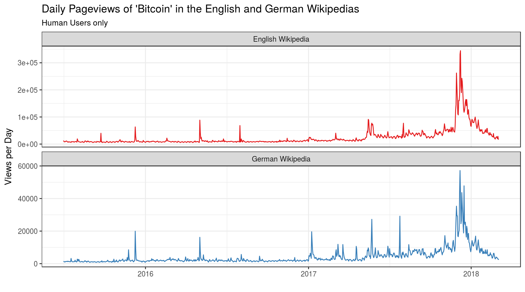
Get some data for the Wikipedia article on Bitcoin:
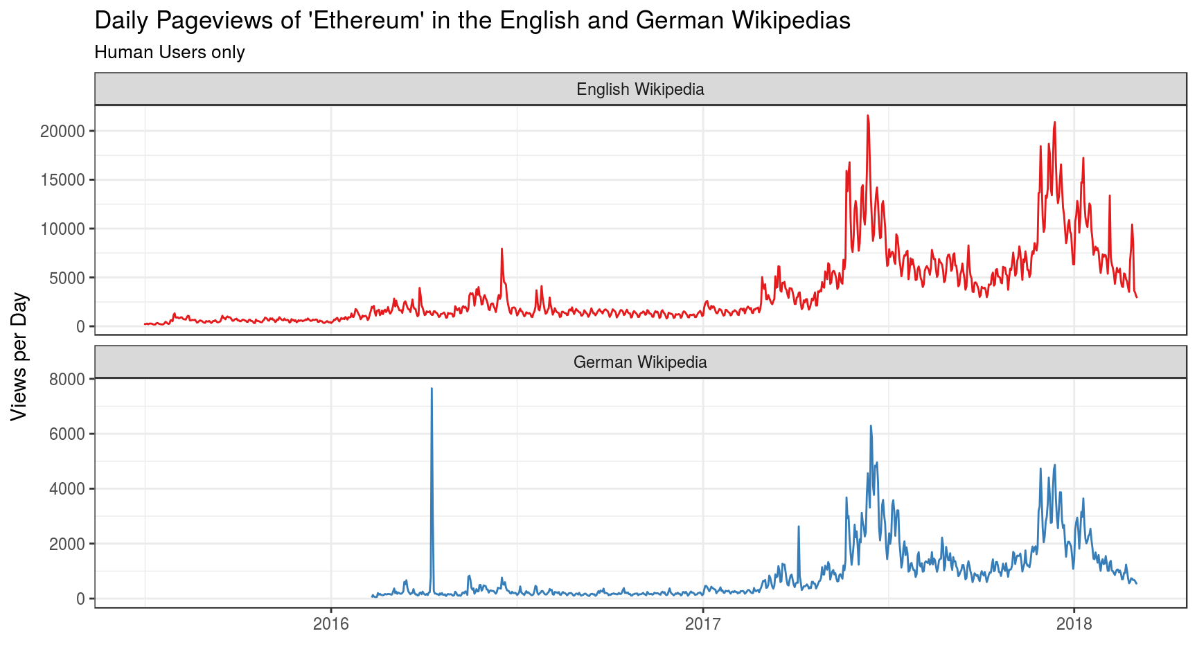
Get some data for the article on Ethereum, another popular cryptocurrency (at this time).
These plots show a lot of things.
- Unsurprisingly, the interest (measured in pageviews) in the English version of the Wikipedia articles is consistently higher than interest in the German version. About 5 times as high.
- Accesses to the Wikipedia articles peaked quite a few times even before the 2017 craze started. (I haven’t looked it up what these events were. Ransomware spreads, perhaps?).
- Interest in Ethereum seems to be disproportionally high in Germany: English pageviews were “only” 3 times as high as German pageviews (usually it’s 5 times as high).
- Strong peaks in Ethereum-article pageviews often occured independently from Bitcoin-Article pageviews, for both language articles.
- (TBC)
Mentions in the New York Times
It is also instructive to check when the Media turned their attention to Bitcoin, and how often they did this over time. The New York Times has a Search API which can be queried for free if you have an API key. This shell script queries the NYT Search API and saves the results into a CSV file:
#!/bin/sh
# following this example:
# https://github.com/jeroenjanssens/data-science-at-the-command-line/blob/master/book/01.Rmd
apikey=c62ffea...........................


parallel --gnu -j1 --delay 8 --results bitcoin \
 "curl -sL  'http://api.nytimes.com/svc/search/v2/articlesearch.json?q=bitcoin&begin_date={1}0101&end_date={1}1231&page={2}&api-key=$apikey'" ::: {2009..2018} ::: {0..99}

# create csv file with command line tools: (cat, jq and json2csv)
cat bitcoin/1/*/2/*/stdout | \
jq -c '.response.docs[] | {date: .pub_date, type: .document_type, title: .headline.main }' \
| json2csv -p -k date,type,title > bitcoin-nytimes.csv
Result - raw data
# date,type,title
# 2011-11-29T00:40:30Z,blogpost,"Today's Scuttlebot: Drones for Everyone, and Bitcoin's Decline"
# 2011-09-07T00:20:26Z,blogpost,Golden Cyberfetters
# 2011-07-04T00:00:00Z,article,Speed Bumps on the Road to Virtual Cash
# 2011-05-30T00:00:00Z,article,Some Faint Praise for Mr. Ballmer
# ...
How often did the word ‘Bitcoin’ appear in articles of the New York Times over the years?
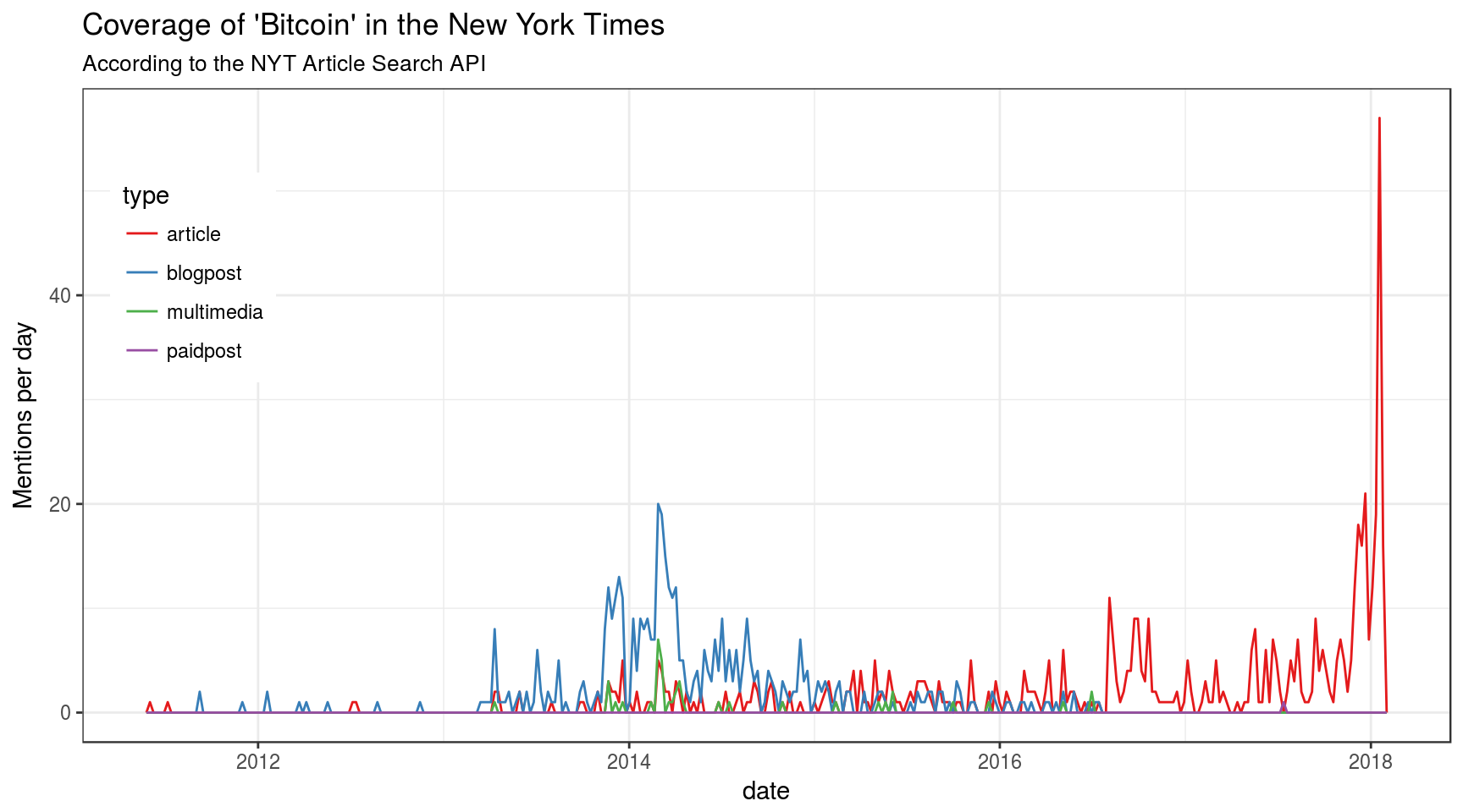
The term ‘Bitcoin’ did hardly appear at all until 2012. The New York Times provides a platform for bloggers and experts such as Paul Krugman for instance. He has talked about Bitcoin in 2014.
Google Trends
There is yet another, alternative data source: Google Trends API, here accessed with functions from the gtrendsR package. The API provides aggregated and rescaled data on how many people have performed Google searches for any term.
Show a plot for comparison:
bitcoin_trends$interest_over_time %>%
  #filter(date >= as.Date("2015-01-01")) %>%
  ggplot(aes(date, hits)) +
  geom_line() +
  theme(legend.position = "none") +
  xlab("") + ylab("Interest") +
  ggtitle(
    sprintf("Google Trends: Worlwide Interest over Time in '%s'", "Bitcoin"),
    subtitle = "(Google internal counters)"
  )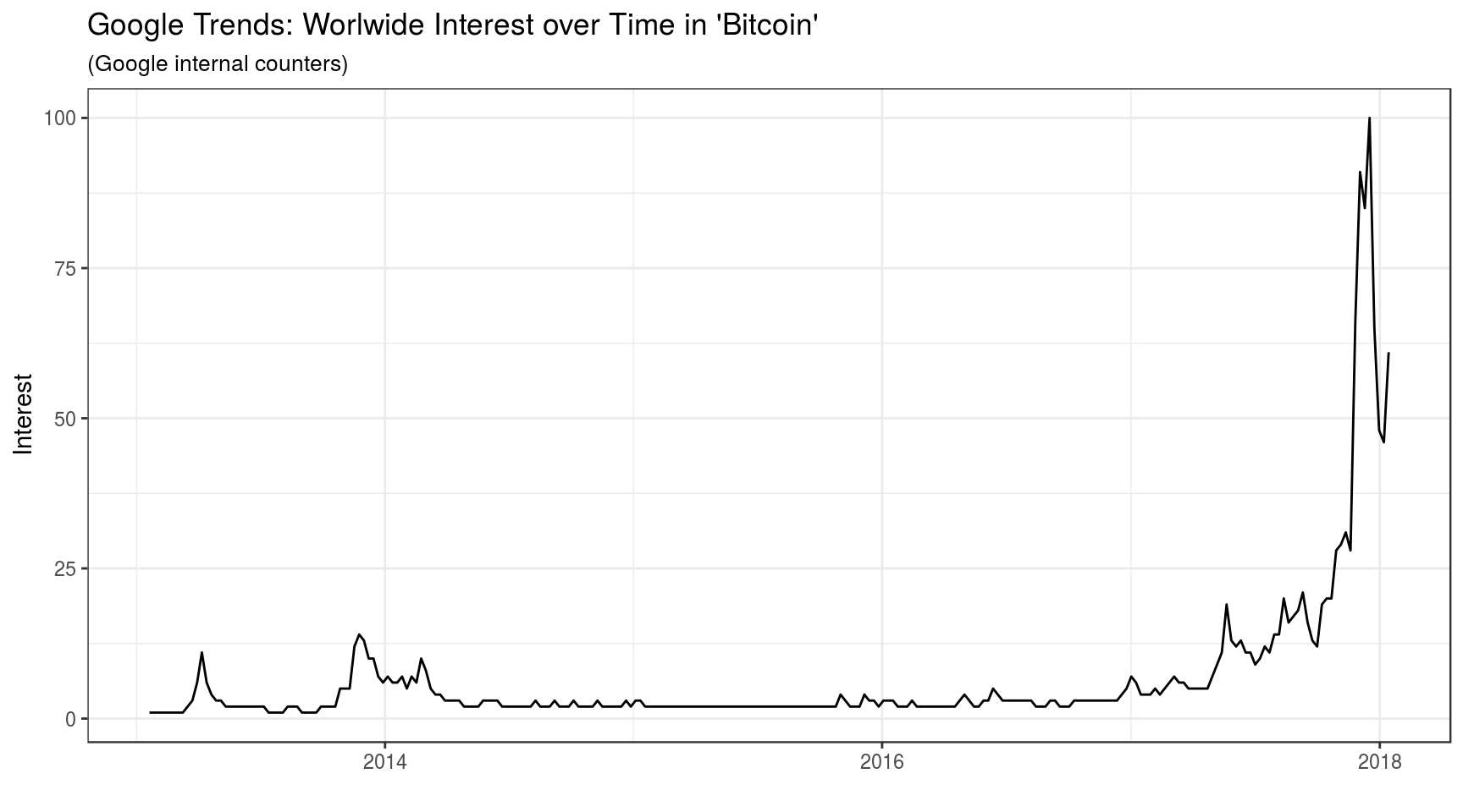
Just as in the Search-API data from the New York Times, a notable spike in the global interest in bitcoin happended in early 2014.
Another obligatory comparison
Last but not least: the exchange rate for Bitcoin, here given in Euro. Data are from Bitcoin.de, aggregated by Quandl.
library(Quandl)
btc <- Quandl(code = "BCHARTS/BTCDEEUR", type = "xts")
autoplot(btc$Close["2015-01-01/"]) +
        ylab("Bitcoin/EUR") + xlab("Year") +
        ggtitle("Bitcoin Exchange Rate 2015-2018",
                subtitle="'Close Price' in EUR, according to the Bitcoin.de trading platform. Data from Quandl.com.")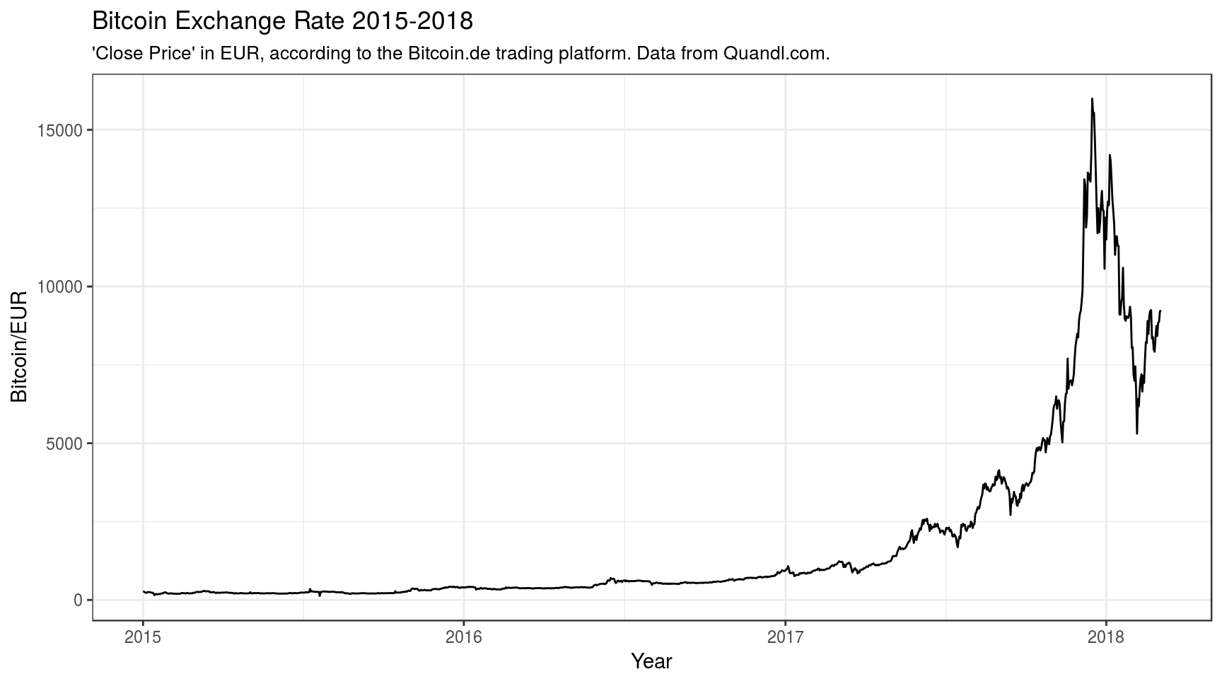
What many people talk about is the ‘volatility’ of Bitcoin. Rarely have I seen someone visualizing this, so here is another plot showing the daily change in the ‘closing price’ (do these trading platforms really close?) for 1 Bitcoin, in Euro:
autoplot(diff(btc$Close["2015-01-01/"])) +
        ylab("Daily Price Change, in EUR/day ") + xlab("Year") +
        ggtitle("Volatility of Bitcoin 'Close Price' 2015-2018",
                subtitle="in EUR, according to the Bitcoin.de trading platform. Data from Quandl.com.")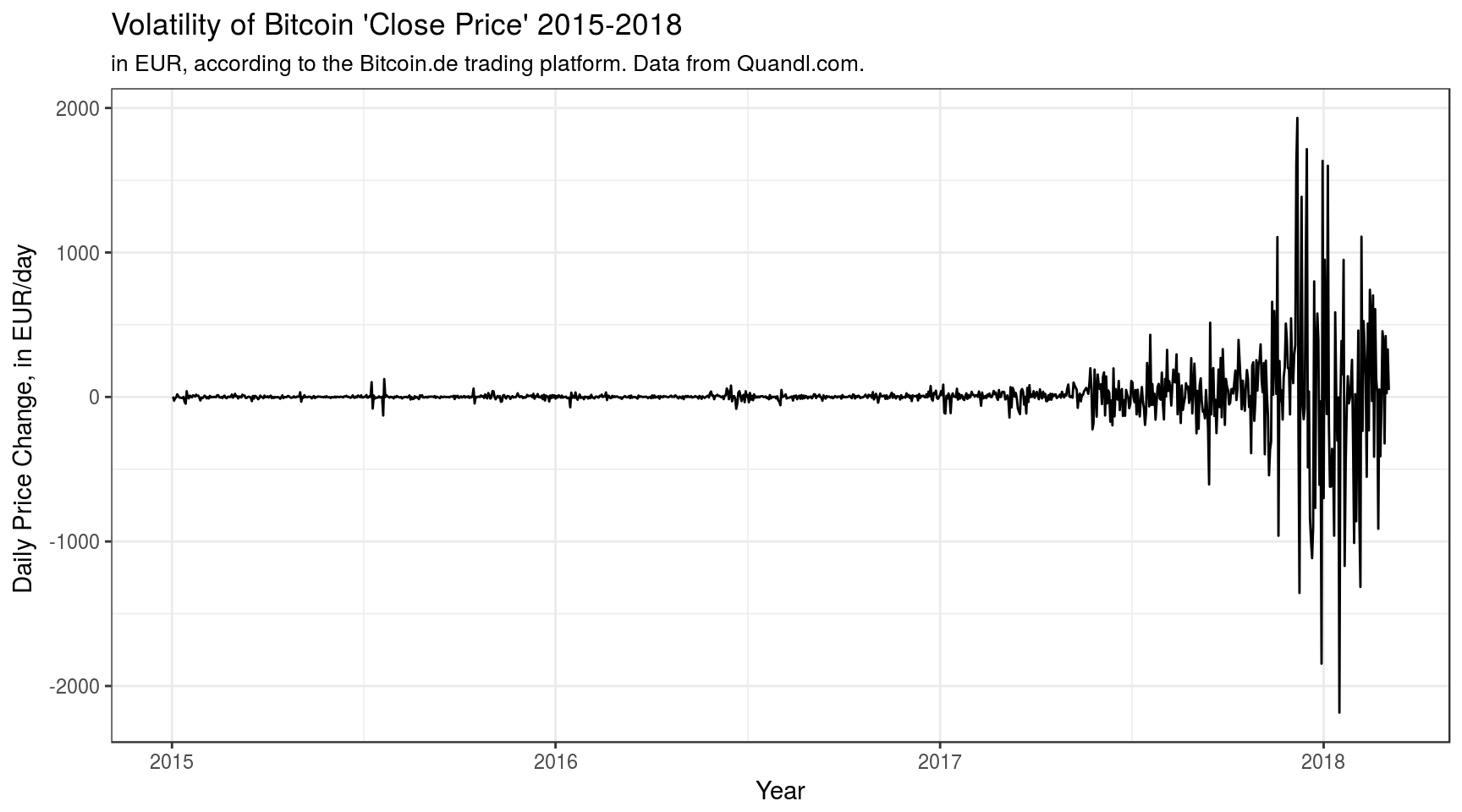
I’ve never seen any financial time series like that.
- Collecting API data
- jq usage, during preprocessing (code not shown))
- Many small R tricks (primarily ggplot2 and RMarkdown stuff)