(Under Construction)
In 2016, I was harvesting tweets from the Twitter streaming API. I’ve used the #rstats hashtag as the search filter. This hashtag is commonly used by the R community on Twitter. Tag #rstats is more descriptive than the too short, unusable, #R hashtag which may not even be a valid filter expression.
Here I do some exploratory analysis of these ~ 1000 tweets, and I visualize the interactions (the “mentions”) of the active Twitter users as a directed graph.
This blogpost is inspired by the Datacamp Class ‘Network Analysis in R’
Preprocessing
Load the necessary R packages, and the datafiles.
library(here)       # filesystem
library(stringr)    #
library(lubridate)  # dateformats
library(threejs)    # interactive plot
library(tidyverse)  #
library(igraph)     # network
library(jsonlite)   # JSON
library(kableExtra) # styled output
datadir <- "data_private/twitter"
# (extracts from the full tweets data, explained below)
infile0 <- here::here(datadir, "rstats_tweettimes.txt")
infile1 <- here::here(datadir, "rstats_network.txt")
infile2 <- here::here(datadir, "rstats_tweettext.txt")
Convert dates to strings, group them into day-of-month, and hours-of-day:
tweettexts <- read_json(infile2, simplifyVector = TRUE) %>%
        select(-dt)

tweetdates <- read_csv(infile0)
# rstats_tweettimes.txt:  "Sun Jul 10 08:14:23 +0000 2016"
tweetdates <- tweetdates %>%
        mutate(dt = str_replace(dt, "\\+0000 ", ""),
               dt = str_replace(dt, "^\\w+ ", ""),
               dt = parse_date_time(dt, orders = c("b d  H:M:S Y")),
               day = day(dt),
               day = sprintf("July %02d", day),
               hour = hour(dt))

tweetdates <- tweetdates %>% inner_join(tweettexts, by = "id")
During the 34 hours from 2016-07-08 22:17:33 to 2016-07-10 08:14:23 I gathered 977 tweets, encoded in JSON format.
Each tweet contains about 2500 characters. This might surprise you, because a tweet used to be 140 characters in length, until Twitter increased it to 280 characters in 2017. But a tweet contains a lot of metadata, and this makes a tweet exceed 2000 characters when serialized to a compact JSON string (not pretty-printed).
In a different blogpost (‘Learning jq’) I’ve explained how to extract specific fields from the nested structure. See example 4.
Plot: Activity over time
This plot shows the user activity during this 3-day period:
theme_set(theme_bw())
tweetdates %>% ggplot(aes(hour)) +
  geom_bar(fill="dodgerblue") +
        facet_wrap(~ day, nrow = 1) +
        xlab("Hour of Day")+ ylab("Tweets per Hour") +
        ggtitle("#Rstats Tweets in July 2016",
                subtitle = "Harvested from the Twitter Streaming API. Local Time Zone: Central European Time (DST).")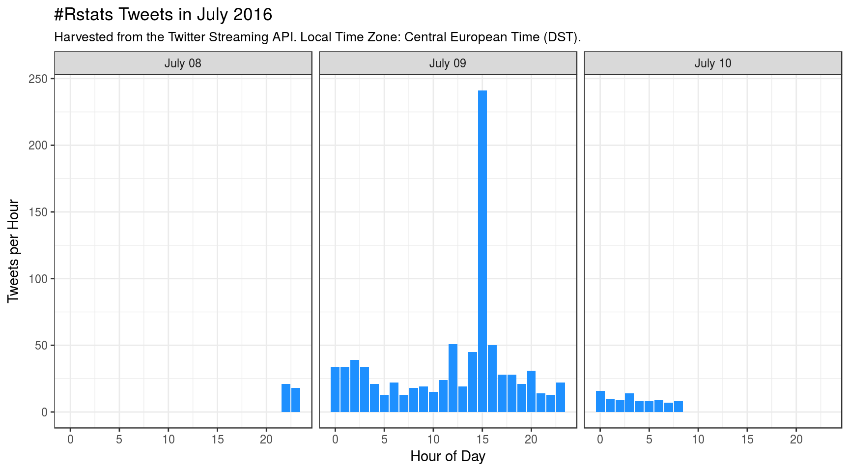
Why is there a peak that happened on July 09 2016 at ~ 15:00 h? Apparently, someone posted a new article “The Mathematics of Machine Learning” on R-bloggers.com, and immediately the article link was shared (retweeted) many times. The article is not that great, so I suspect this sharing is no true human activity, but some form of Twitter spam, as shown below.
The tweet text that was shared 165 times was:
RT @craigbrownphd: The Mathematics of Machine Learning: (This article was first published on R – Data Scie… https://t.co/LO0G06avIl #…
Constructing the interactions network
Using the jq tool, I’ve contructed a separate text file containing the user data and the important “mentions” metadata. Read in the file, as a data frame:
mentions <- read_csv(infile1)
# remove leading "_" from column names
colnames(mentions) <- gsub("^_", "", colnames(mentions), perl = TRUE)
# show a few entries
w_html <- knitr::kable(mentions %>%  mutate(id=as.character(id)) %>%  head(5),
             align = "rllrll")

kable_styling(w_html, "striped", position = "left", font_size = 14)| id | name | screen_name | mentions_id | mentions_name | mentions_screen_name |
|---|---|---|---|---|---|
| 622262193 | ReactJS News | ReactJS_News | 2.45e+08 | timelyportfolio | timelyportfolio |
| 151588786 | Alex Bertram | bedatadriven | 5.53e+08 | Maarten-Jan Kallen | mj_kallen |
| 1553414406 | Lovedeep Gondara | LovedeepSG | 1.45e+08 | R-bloggers | Rbloggers |
| 4277617239 | Javascript Bot | JavascriptBot_ | 6.22e+08 | ReactJS News | ReactJS_News |
| 4277617239 | Javascript Bot | JavascriptBot_ | 6.22e+08 | ReactJS News | timelyportfolio |
Convert it to an igraph object gr, a network:
users <- mentions %>%
        select(name) %>%
        dplyr::union(mentions %>%
                             select(mentions_name) %>%
                             rename(name ="mentions_name"))


gr <- mentions %>%
        select(name, mentions_name) %>%
        unique() %>%
        filter(name != mentions_name) %>%
        graph_from_data_frame(directed = TRUE, vertices = users)
The graph has 747 Nodes and 1029 Edges. Show a few edges:
E(gr) %>% head(20)## + 20/1029 edges from 0b62eae (vertex names):
## [1] ReactJS News ->timelyportfolio
## [2] Alex Bertram ->Maarten-Jan Kallen
## [3] Lovedeep Gondara->R-bloggers
## [4] Javascript Bot ->ReactJS News
## [5] Javascript Bot ->timelyportfolio
## [6] DeepSingularity ->Dr. GP Pulipaka
## [7] HAL 9000 ->Dr. GP Pulipaka
## [8] XMJ ->One R Tip a Day
## [9] Relearn ML ->R-bloggers
## [10] Alejandro ->RStudio
## + ... omitted several edgesThis means that the twitter user on the left mentioned or retweeted the person on the right.
Now I calculate a node-property called ‘Eigenvector-Centrality’ \(ec\), a measure which gives higher scores to nodes that are well-connected with other well-connected nodes. The value of \(ec\) is between 0 and 1, and most of them close to 0, so I also take logarithms, creating a two-column dataframe for easier plotting.
ec <- as.numeric(eigen_centrality(gr)$vector)
ecdf <- data.frame(ec = ec, eclog = log(ec))
A density plot of the eigenvector centrality shows its weird distribution:
#vlines <- c(-3, -11, -41)
vlines <- c(-36, -9, 0) # minima
ggplot(ecdf , aes(eclog)) +
        geom_density(na.rm = TRUE) +
        ggtitle("Density Plot of Eigenvector Centralities") +
        xlab("ln(Eigenvector Centrality)") +
        xlim(c(-50,0)) +
        geom_vline(xintercept = vlines,
                   color=c(blues9[9], blues9[3], "dodgerblue"),
                   linetype="dotted" , size=1) +
        ggtitle("Density plot of Eigenvector Centrality",
                subtitle =
"Weird distribution can be used to color the nodes in the plot below")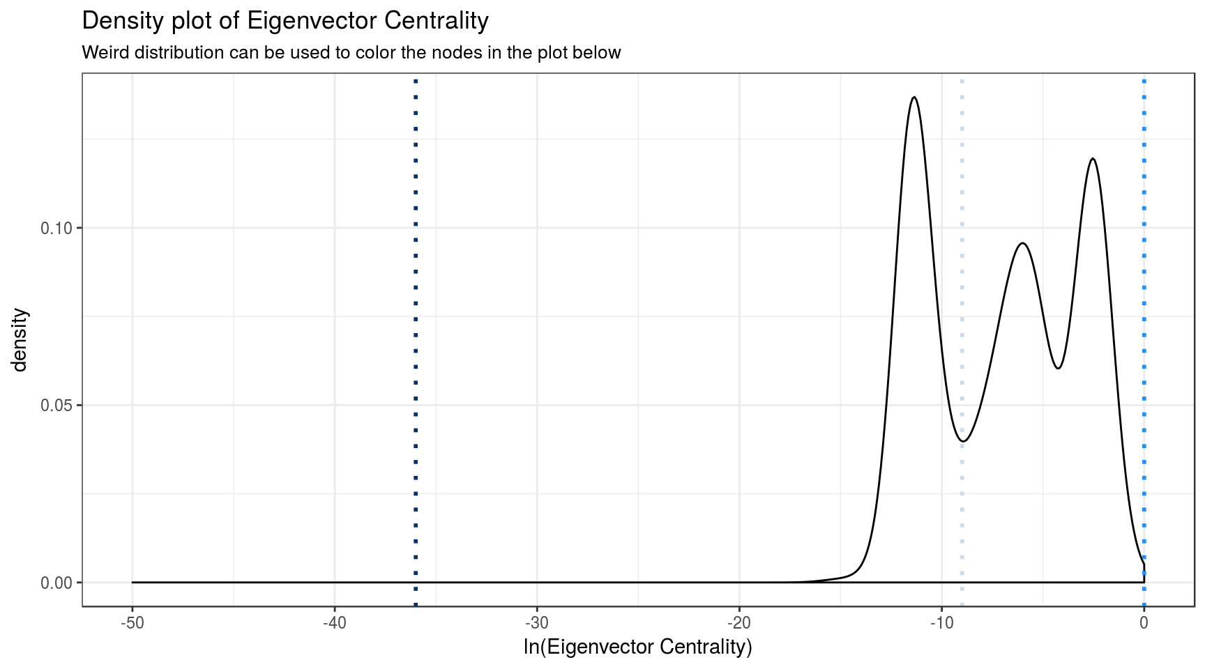
The nodes with the smallest eigenvector centrality ec will be filled with the darkest blue, and nodes with higher-values of ec (close to 1) will be colored dodgerblue, which is similar to the iconic blue of the Twitter logo. Intermediate values will be colored pale blue.
bluevals <- map(ecdf$eclog, function(x, ec){
        if(x < vlines[1] ) blues9[9]
        else if(x < vlines[2]) blues9[3]
        else "dodgerblue"
                })
gr <- set_vertex_attr(gr, "color", value = bluevals)
A single Vertex and its attributes, ‘name’ and ‘color’:
V(gr)[[1]] ## + 1/747 vertex, named, from 0b62eae:
## $name
## [1] "BrisUsersofRGroup"
##
## $color
## $color[[1]]
## [1] "#08306B"Color depends on the Eigenvector Centrality.
Plot: The network
Only tweets mentioning or retweeting someone else are shown here. Sole Twitter users who have used the #rstats hashtag but were not mentioning anyone else are not shown.
# Scaling factor:
# Create new vector 'v' that is equal to the square-root of 'ec'
# multiplied by factor, here: ec^-1/8
v <- ec^0.125

# Plot threejs plot of graph setting vertex size to v
graphjs(gr, vertex.size = v, vertex.label = V(gr)$name,
        main="#Rstats Tweets network, 34 hours in July 2016")
Move the mouse pointer over the plot and press the left button, then drag the mouse pointer around. Mouse wheel enlarges. Mouse over Node shows author of tweet.
Some observations
If you carefully move the network and point to the central node you can verify for yourself that the node representing ‘Hadley Wickham’ sits at the center of the large cluster with the large nodes. The node has 167 incoming links, and 6 outgoing links (he mentioned 6 people). Hadley has an \(ec\)-value of 1.
Here are some links from the “true” R community.
| mentioner_id | mentioned_id | mentioner | mentioned |
|---|---|---|---|
| 704 | 694 | Hadley Wickham | Michael Levy |
| 703 | 704 | Daniel Anderson | Hadley Wickham |
| 702 | 704 | cody markelz | Hadley Wickham |
| 700 | 704 | Waclaw Kusnierczyk | Hadley Wickham |
| 699 | 704 | W. Kyle Hamilton | Hadley Wickham |
| 697 | 704 | Salamanda | Hadley Wickham |
| 694 | 704 | Michael Levy | Hadley Wickham |
| 693 | 704 | Karl Broman | Hadley Wickham |
| 692 | 704 | Alice Data | Hadley Wickham |
| 691 | 704 | fxrc0de | Hadley Wickham |
| 688 | 704 | christopherlortie | Hadley Wickham |
| 687 | 704 | Alberto Martín | Hadley Wickham |
| 684 | 704 | AmarnathK | Hadley Wickham |
| 681 | 704 | Bryce Mecum | Hadley Wickham |
| 680 | 704 | Alice Sweeting | Hadley Wickham |
Another notable feature in the network is the pale blue structure with the many tiny spheres attached. Interestingly, this represents the highly-retweeted tweet by “Craig Brown, Phd”, mentioned above. The announcement of a new article on r-bloggers was mentioned by a lot of people in their tweets, but the people who retweet him hardly got any mentions themselves. The users he mentions have names like ‘GimmieKiss’ and also have lots of emoticons in their names (Check by pointing the mouse over some of those pale blue nodes). Maybe this is a form of Twitter-Spam.
There are also some smaller communities (twitter users that refer to each other) that do not mention anyone from the larger R community. Maybe this is also spam. I haven’t looked, and I won’t show a table with member data here.
More about the Hadley node
The next plot shows a subgraph: only those nodes interconnected with the Hadley Node up to a geodesic distance of length(colors).
The Hadley node has a black color, its next neighbors are shown in red, the neighbors of the neighbors (having a geodesic distance of 2) are orange, and so on.
Move the mouse pointer over the plot and press the left button, then drag the mouse pointer around. Mouse wheel enlarges. Mouse over Node shows author of tweet.
I find it amazing that this small (n ~ 1000) set of tweets, harvested at a seemingly random point in time (July 2016) reflects quite well how I perceive the structure the R community on Twitter.
metrics <- purrr::map_df(V(gr)$name, function(name = n) {
        data.frame(nm = name,
                n_tri = count_triangles(gr, vids=name),
                n_trans_loc = transitivity(gr, vids = name, type='local'))
        })
# which are the most prominent nodes
# metrics %>% arrange(desc(n_tri)) %>%  filter(n_tri > 5)
#
# ggplot(metrics, aes(n_trans_loc, n_tri)) +
#         geom_point()
The Largest Cliques are these:
largest_cliques(gr)## [[1]]
## + 5/747 vertices, named, from 0b62eae:
## [1] Hadley Wickham Colin Rundel wercker
## [4] Mine CetinkayaRundel Isabella R. Ghement
##
## [[2]]
## + 5/747 vertices, named, from 0b62eae:
## [1] Hadley Wickham Colin Rundel wercker
## [4] Mine CetinkayaRundel Robin Genuer
##
## [[3]]
## + 5/747 vertices, named, from 0b62eae:
## [1] Hadley Wickham Colin Rundel wercker
## [4] Mine CetinkayaRundel Joe Blitzstein
##
## [[4]]
## + 5/747 vertices, named, from 0b62eae:
## [1] Hadley Wickham Colin Rundel wercker
## [4] Mine CetinkayaRundel Andee KaplanThere are so many Max Cliques from 2 to 5 Members:
# Determine all maximal cliques in the network
# and assign to object 'clq'
clq <- max_cliques(gr)

# Calculate the size of each maximal clique.
table(unlist(lapply(clq, length)))
##
## 2 3 4 5
## 542 212 9 4More ideas:
- “Betweenness analysis”
- More thoroughly include more twitter data, e.g. follower-counts
- Analysis of a larger Twitter dataset (about a different subject)