Blood Pressure as a function of age and body weight
Recently, conversations with friends and colleagues had me thinking about blood pressure. Then I’ve remembered that weekend project from late 2017. Back then I had briefly analysed two datasets: one available on the internet, the other available as R package NHANES on CRAN.
My motivation for writing this up was (1) learning more tricks with visualization library ggplot, and more importantly, (2) gaining insights from a real study that interests me. It was also a helpful strategy to start with a hypothesis derived from a small teaching-dataset, then switch to a messier, larger dataset: a real medical study with data from 10000 people.
Preprocessing
Load the necessary packages. Nothing fancy here.
library(readxl) # for mlr02.xls from http://college.cengage.com/
library(tidyverse)
library(NHANES) # Body Shape + related measurements from 10000 US citizens
data(NHANES)
Download dataset 1: A tiny 11*4 table called Systolic Blood Pressure. It comes from a book publisher’s website. Maybe it is a teaching dataset; perhaps it is supplementary material for a college textbook.
The markdown version of this blog post contains the necessary instructions on how to download and import the data.
Dataset 1
The dataset is tiny:
## Observations: 11
## Variables: 4
## $ blood_pressure <int> 132, 143, 153, 162, 154, 168, 137, 149, 159, 12...
## $ age            <int> 52, 59, 67, 73, 64, 74, 54, 61, 65, 46, 72
## $ weight_pounds  <int> 173, 184, 194, 211, 196, 220, 188, 188, 207, 16...
## $ weight         <dbl> 78.5, 83.5, 88.0, 95.7, 88.9, 99.8, 85.3, 85.3,...
We can plot it in its entirety. I also fit a simple linear regression model to the data: Blood Pressure as a function of a person’s age and body weight.
Adding the predictions from the model to the plot:
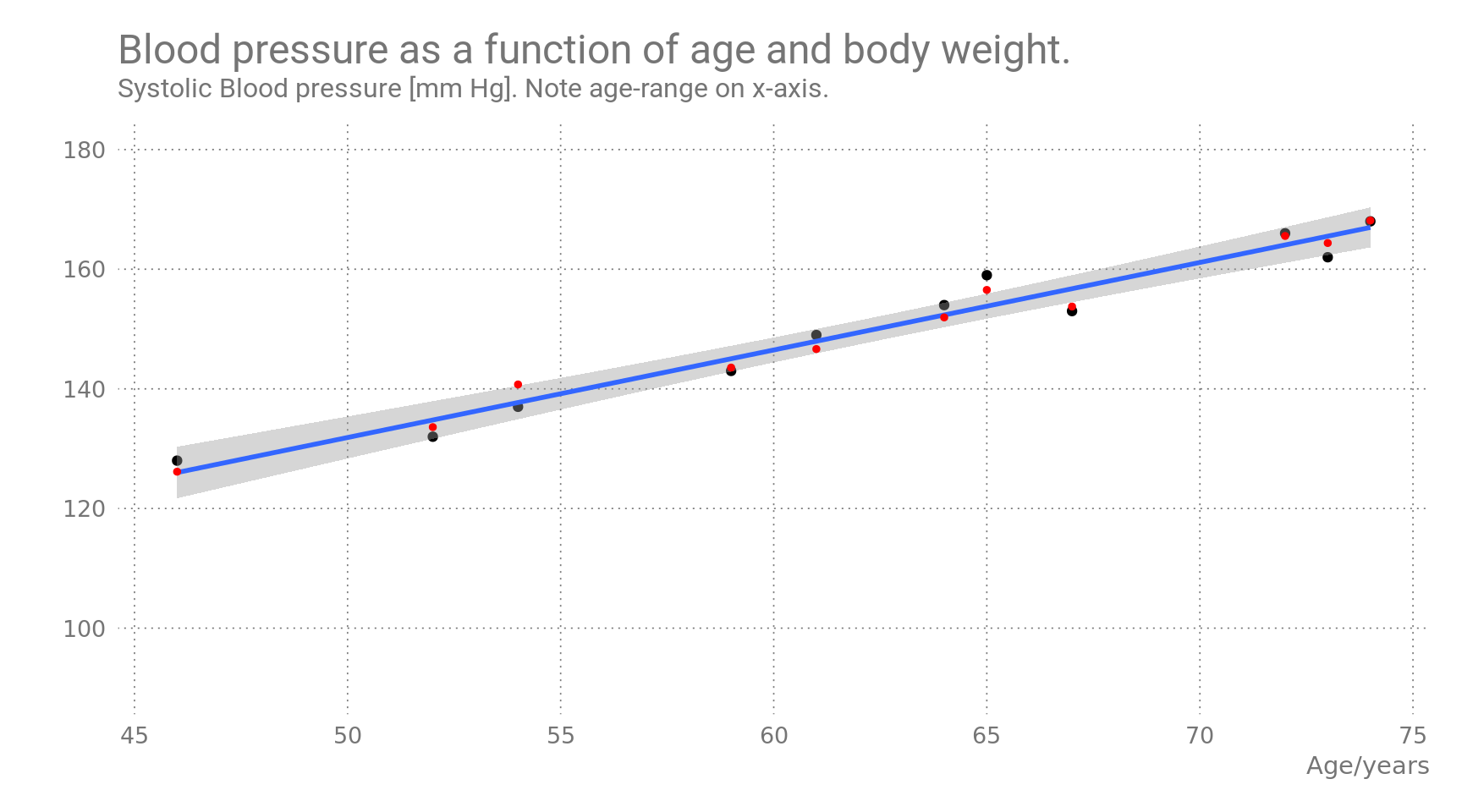
Figure 1: Predicted values are shown in red, observed values in black.
The linear regression model shows a strong correlation of blood pressure with age and weight. For a single-parameter model, (age as sole predictive variable), the predicted values would fall on the blue line. Inclusion of body weight as a second predictive variable seems to improve the fitted values slightly, as the red dots show.
Also, for 45-year olds the average blood pressure is already well over 120.
For the R specialists, this is the summary of the regression model:
##
## Call:
## lm(formula = blood_pressure ~ age * weight, data = bloodpressure)
##
## Residuals:
##    Min     1Q Median     3Q    Max
## -3.735 -1.181 -0.137  1.955  2.463
##
## Coefficients:
##             Estimate Std. Error t value Pr(>|t|)
## (Intercept)  11.3482    70.4175    0.16     0.88
## age           1.1439     1.0303    1.11     0.30
## weight        0.9819     0.9120    1.08     0.32
## age:weight   -0.0035     0.0123   -0.28     0.78
##
## Residual standard error: 2.46 on 7 degrees of freedom
## Multiple R-squared:  0.977,  Adjusted R-squared:  0.967
## F-statistic: 99.6 on 3 and 7 DF, p-value: 4.19e-06Let’s try a larger dataset!
NHANES dataset
The NHANES dataset is available as an R package on CRAN. It contains data from the US National Health and Nutrition Examination Study. I have used package version 2.1.0, specifically “NHANES 2009-2012 with adjusted weighting”. This dataset contains some corrections for undersampling racial minorities. Uncorrected data is also available, in the NHANESraw package.
The dataset is big, very big. It contains 10000 rows (People, anonymized) and 76 columns (features). Listing all column definitions here would waste too much screen space. See http://www.cdc.gov/nchs/nhanes.htm for details. I’ll concentrate on the relevant columns:
Column names containing “Age”:
## [1] "Age"           "AgeDecade"     "AgeMonths"     "DiabetesAge"
## [5] "Age1stBaby"    "SmokeAge"      "AgeFirstMarij" "AgeRegMarij"
## [9] "SexAge"
Column names containing “Weight”:
## [1] "Weight"Column names containing the prefix “BP” (Blood Pressure):
## [1] "BPSysAve" "BPDiaAve" "BPSys1"   "BPDia1"   "BPSys2"   "BPDia2"
## [7] "BPSys3"   "BPDia3"
The participants had their Blood Pressure measured up to 3 times. These values were summarized in the BPSysAve column.
There are relatively few NA or NULL values in the dataset:
##      Age   Weight BPSysAve BPDiaAve   BPSys1   BPDia1   BPSys2   BPDia2
##        0       78     1449     1449     1763     1763     1647     1647
##   BPSys3   BPDia3
##     1635     1635
Create a smaller NHANES dataset, bloodpressure2, containing relevant columns only:
bloodpressure2 <- NHANES %>%
    select(BPSysAve, Age, AgeDecade, Weight, Gender, BMI) %>%
    filter(!is.na(BPSysAve), !is.na(Weight), !is.na(BMI))
The NAs are gone.
We include Gender and BMI (Body Mass Index) for later.
The reduced dataset contains 8487 rows (People) and 6 columns.
Summary of Blood Pressure Data:
##     BPSysAve        Age         AgeDecade        Weight         Gender
##  Min.   : 76   Min.   : 8.0    40-49 :1350   Min.   : 17.1   female:4270
##  1st Qu.:106   1st Qu.:24.0    10-19 :1311   1st Qu.: 62.2   male  :4217
##  Median :116   Median :40.0    20-29 :1300   Median : 76.1
##  Mean   :118   Mean   :40.9    30-39 :1266   Mean   : 77.9
##  3rd Qu.:127   3rd Qu.:56.0    50-59 :1254   3rd Qu.: 91.1
##  Max.   :226   Max.   :80.0   (Other):1695   Max.   :230.7
##                               NA's   : 311
##       BMI
##  Min.   :12.9
##  1st Qu.:22.8
##  Median :26.6
##  Mean   :27.6
##  3rd Qu.:31.4
##  Max.   :81.2
##
The maximum value of 80 for Age actually represents “Adults of age 80 and older”. See plots below.
Blood Pressure by Gender:
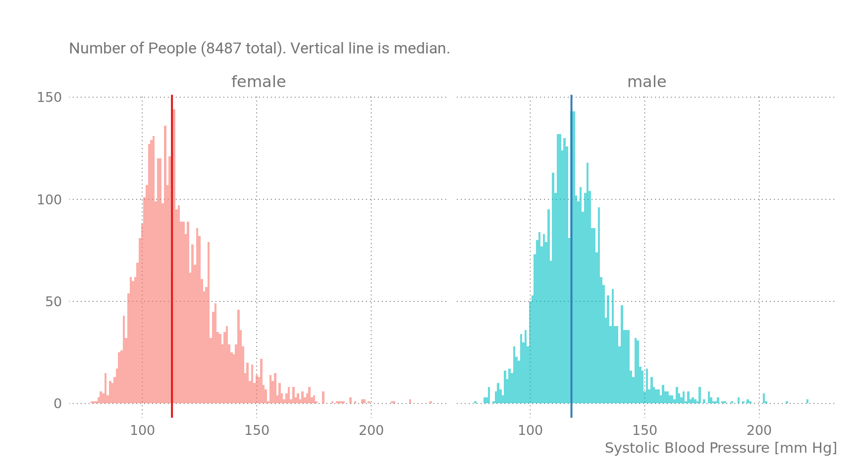
Figure 2: Blood Pressure by Gender, NHANES Dataset.
Apparently, there is not much difference between the genders, the median BP for women is 113mmHg and for men it is 118 mmHg. Splitting by age group reveals a different picture.
Blood Pressure by Age Group
After splitting the dataset by life decade, we get this:
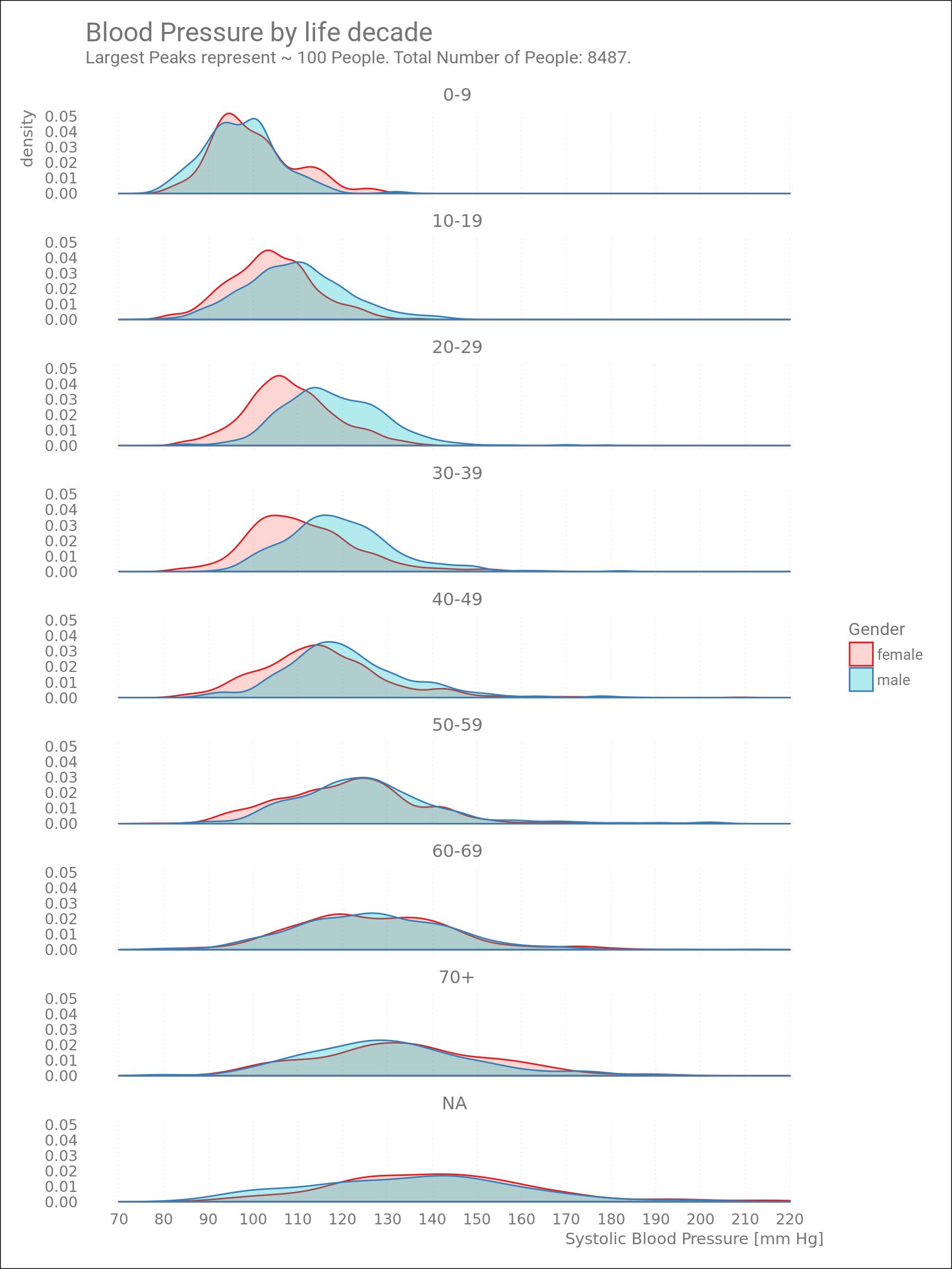
Figure 3: Blood Pressure by Age Group.
For kids below 10 years of age, Blood Pressures (BP) of boys and girls are equal. The majority of BP values are about 100 mm Hg, for both genders. Blood Pressures of teenage boys and 20-30 year-old men are already higher than their female “counterparts”.
(Originally I made the above plot with BMI data instead of BP. This was also very informative, especially the multimodal density plots of “young people” agegroups, but I’ll focus on BP here.)
Blood Pressures generally increase over the years, but is this rate really 9 mm/year, as indicated above in Fig.1?
Linear modeling
Fit a linear regression model (Blood Pressure as a function of Age and Body Weight) to the entire bloodpressure2 subset, just as above for the tiny dataset.
I have included the interaction term age:weight because from experience it makes sense: older bodies metabolize more differently, and thus at each age the human body has different rates of gaining weight.
For the R experts, the model summary:
##
## Call:
## lm(formula = BPSysAve ~ Age * Weight, data = bloodpressure2)
##
## Residuals:
##    Min     1Q Median     3Q    Max
## -50.14  -8.60  -0.92   7.41 102.36
##
## Coefficients:
##              Estimate Std. Error t value Pr(>|t|)
## (Intercept) 81.760420   1.049953    77.9   <2e-16 ***
## Age          0.719361   0.026467    27.2   <2e-16 ***
## Weight       0.275489   0.014704    18.7   <2e-16 ***
## Age:Weight  -0.004387   0.000352   -12.5   <2e-16 ***
## ---
## Signif. codes:  0 '***' 0.001 '**' 0.01 '*' 0.05 '.' 0.1 ' ' 1
##
## Residual standard error: 14.4 on 8483 degrees of freedom
## Multiple R-squared:  0.299,  Adjusted R-squared:  0.299
## F-statistic: 1.21e+03 on 3 and 8483 DF,  p-value: <2e-16
The significance of Age and Body Weight is very high, but the general correlation is weak ( R² = 0.286). This can also be seen in the following plots.
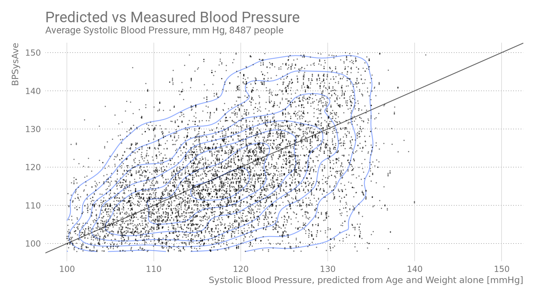
Figure 4: Predicted vs Measured Blood Pressure.
The back diagonal line is the 1:1 line. Blue isolines indicate statistical density.
Predicted values of the full model fall short of capturing the variability in the data. Maybe other factors have to be taken into into account (but not in this blogpost).
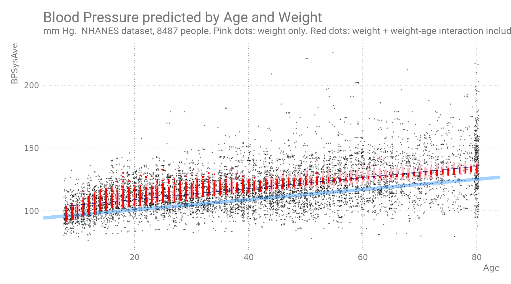
Figure 5: Blood Pressure as a function of Age and Weight. Predicted values are shown in pink/red, observed values in black. Blue line is BP predicted a function of Age alone. Black line is BP modeled with weight/age interaction effect.
In the plot above, pink symbols are predicted values from age and weight without interaction, whereas red symbols represent predictions which include an interaction term between age and weight. The interaction term seems to become increasingly more relevant with higher ages, changing the sign of the effect size. Honestly, I am not sure what I am looking at here. (TODO)
Maybe we need to split by age group again?
Boxplots of Blood Pressures of 10-year age groups
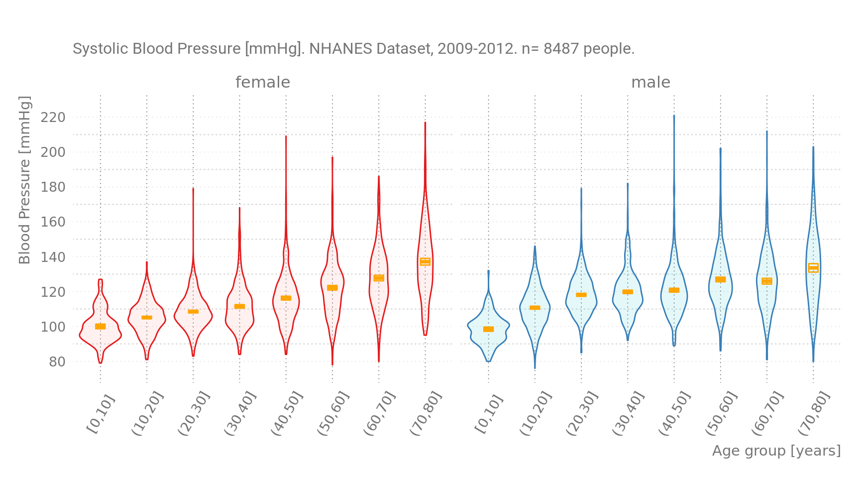
Figure 6: Blood Pressure by Age group. Orange Symbols are sample means.
Note that this plot is essentially the same as Figure 3, only the density plots are rotated 90 degrees.
Comparing this with Figure 1, the toy dataset, I think the violin plot above shows that it is the Blood Pressures from the female subgroup that increase linearly with age. Blood Pressure of men has already increased earlier, in their twenties. Men generally have “unhealthier” values also for body weight, and do so at earlier ages (again: informative BMI distributions by age group not shown).
Comparing myself with men of similar age, weight and BMI
In the last years my weight was between 70 and 80 Kilos, and I was always slightly to moderately overweight, so let’s say my Body Mass Index varied between 25 to 30.
Let’s build a new dataset bloodpressure3 similar to the toy dataset from Figure 1, but with data from real people. We’ll use our subset bloodpressure2 from the NHANES data, by filtering with these citeria:
bloodpressure3 <- bloodpressure2 %>%
         filter(BMI >= 25 , BMI <= 30,
               Weight >=70, Weight <= 80) %>%
        filter( Gender == "male", Age >= 45 ) %>%
         select(-Gender, -prediction)

bloodpressure3_model <- lm(BPSysAve ~ Age * Weight, data = bloodpressure3) #
bloodpressure3$Predictions <- predict(bloodpressure3_model) # same data

summary(bloodpressure3)
## BPSysAve Age AgeDecade Weight BMI
## Min. : 93 Min. :45.0 50-59 :73 Min. :70.0 Min. :25.1
## 1st Qu.:115 1st Qu.:50.0 60-69 :36 1st Qu.:73.8 1st Qu.:25.7
## Median :126 Median :58.0 40-49 :32 Median :76.5 Median :26.5
## Mean :126 Mean :59.6 70+ :29 Mean :76.1 Mean :26.8
## 3rd Qu.:134 3rd Qu.:67.0 0-9 : 0 3rd Qu.:78.3 3rd Qu.:27.9
## Max. :179 Max. :80.0 (Other): 0 Max. :80.0 Max. :29.8
## NA's :14
## prediction_ia Predictions
## Min. :120 Min. :114
## 1st Qu.:122 1st Qu.:122
## Median :125 Median :125
## Mean :126 Mean :126
## 3rd Qu.:129 3rd Qu.:131
## Max. :134 Max. :141
## 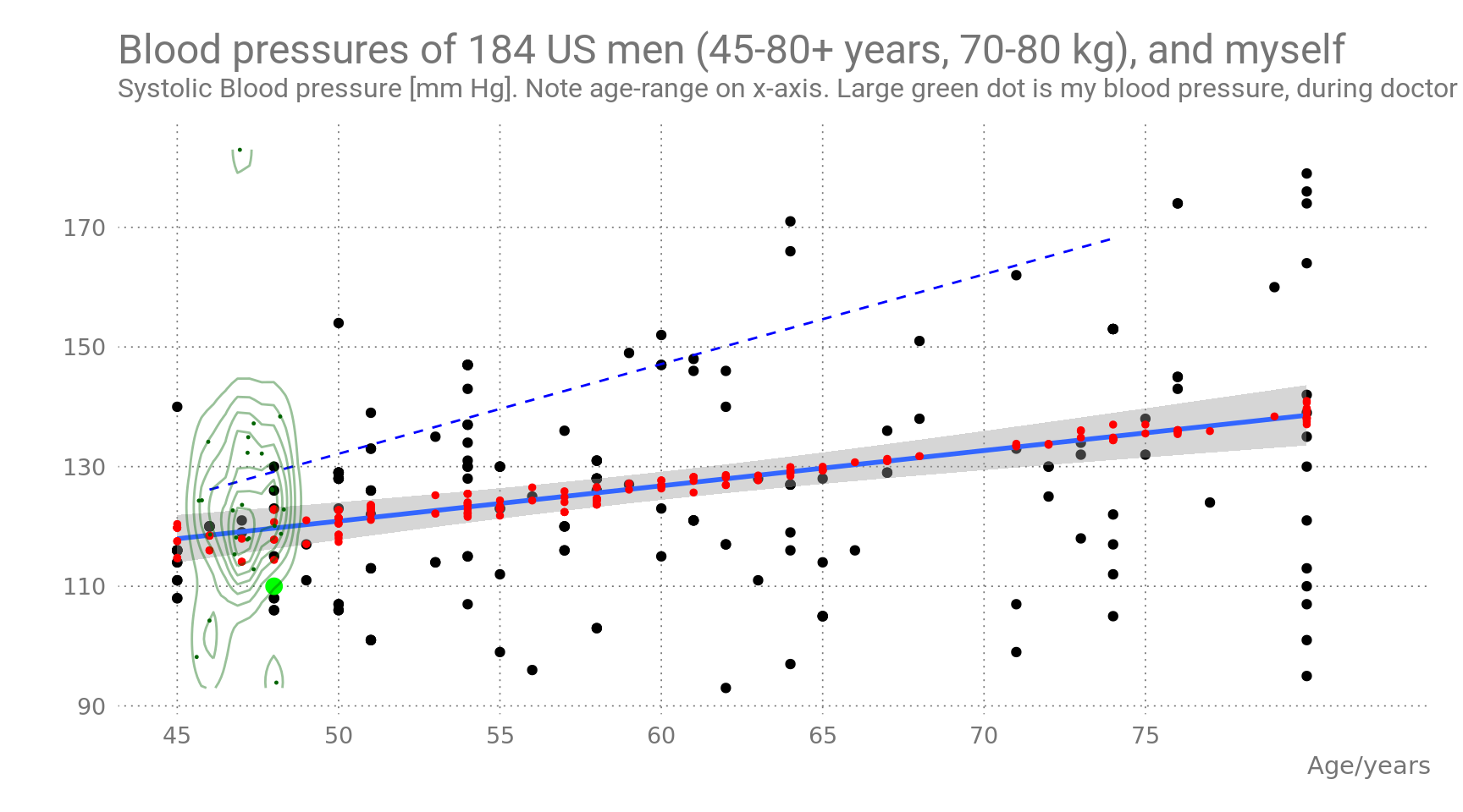
Figure 7: Blood pressure as a function of age and body weight. NHANES data filtered to match age-range of Figure 1, and my own BMI- and weight-range. Red dots are predicted values by the two-regressor model.
The solid blue line shows the predictions by age alone. The slope is 3.998 mmHg/yr, much lower than the slope in Figure 1 which was 1.144. The equivalent regression line from Figure 1 is shown as a dashed blue line.
The large green dot shows my personal Age/BP data, measured 2014-2017 by my doctor, as far I remember it (always BP = 110 mmHg). Tiny dark green dots and isolines represent BP values stored on my own BP measurement device which might have been used on other family members (I don’t remember).
For the R experts:
##
## Call:
## lm(formula = BPSysAve ~ Age * Weight, data = bloodpressure3)
##
## Residuals:
##    Min     1Q Median     3Q    Max
## -42.07  -9.60   0.63   7.35  41.98
##
## Coefficients:
##              Estimate Std. Error t value Pr(>|t|)
## (Intercept) -140.1094   207.0734   -0.68     0.50
## Age            3.9978     3.3838    1.18     0.24
## Weight         3.0284     2.7034    1.12     0.26
## Age:Weight    -0.0445     0.0441   -1.01     0.31
##
## Residual standard error: 16.2 on 180 degrees of freedom
## Multiple R-squared:  0.142,  Adjusted R-squared:  0.128
## F-statistic: 9.95 on 3 and 180 DF, p-value: 4.21e-06- Gaining insights by switching from a tiny to a bigger dataset
- New tricks with ggplot2
- Splitting continuous data into categories / age groups was really helpful here
- Compared my own health status relative to others
- Studied health status of a real population as a whole
- Thought long about a two-variable multinomial linear regression model